Case Study

Fundraising Everywhere – UX Enhancements

Fundraising Everywhere provides virtual events, training, and resources for fundraisers across organisations of all sizes. Their platform enables fundraisers to purchase tickets for one-off events and sign up for memberships that give ongoing access to learning opportunities, community and support.


While they awaited a full website redesign and build project, Filter helped them improve areas of their existing Elementor-built site.

WordPress Elementor WooCommerce Conversion Rate Optimisation
A person sits at a desk, engaged in a video call on a laptop. The screen displays a smiling individual, while a large, open book rests nearby. The setting suggests a collaborative learning or discussion environment.

Introduction

Enhancing the Event Purchasing Journey

Fundraising Everywhere wanted a fresh approach to improving their event purchasing journey. Their Elementor WordPress site, while functional, lacked flexibility and clear conversion pathways.


Working within the existing platform, Filter enhanced layouts, strengthened calls to action and introduced clearer, more engaging membership and event details.


These targeted improvements delivered immediate benefits while laying the groundwork for a future full rebuild.

Relationship Length

Long-term digital partner

Focus

Improving the purchasing experience for event tickets and memberships

Problem Problem

  • Their existing Elementor build limited flexibility for content updates
  • Calls to action highlighted on the website were easy to overlook
  • Membership benefits and event value were unclear

Solution Solution

  • Redesigned product cards, side cart, and checkout for clarity and upsells
  • Expanded membership pages and improved partner/sponsor visibility
  • Enhanced event, speaker, and video content presentation

Result Result

  • Easier ticket purchasing and membership sign-up
  • Improved engagement with clearer, more compelling content
  • Stronger conversion focus while planning the full site rebuild

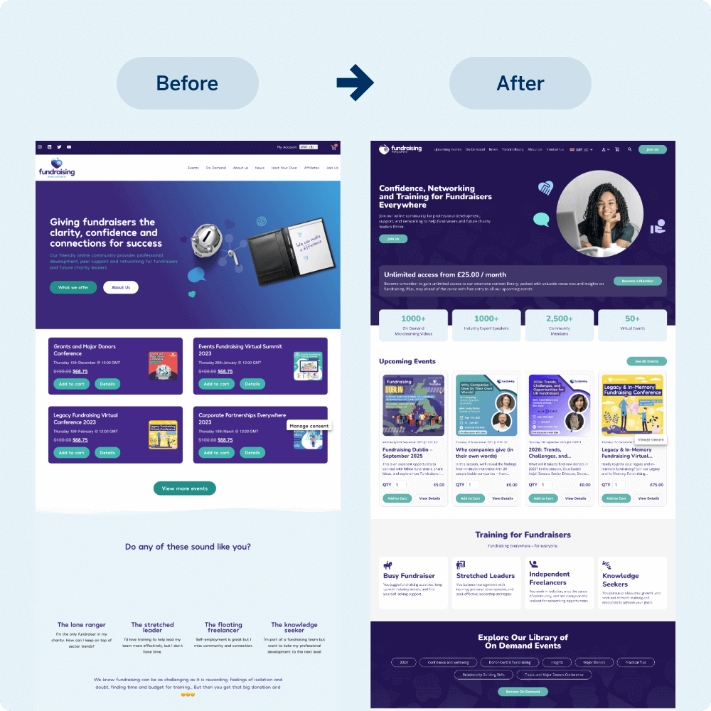
A side-by-side comparison of a website redesign shows the previous layout on the left with a cluttered appearance and the updated version on the right, featuring a cleaner design and improved navigation for fundraisers, enhancing usability and clarity.

Challenge

The existing site, built by a previous agency, had an Elementor and WooCommerce setup that worked at a basic level but did not support long-term scalability or strong conversions.

Calls to action were easy to miss, membership benefits were not well communicated, event details were underplayed and there were few upselling opportunities at checkout. Video content was not used effectively, limiting engagement.

Our Approach

Working closely with the Fundraising Everywhere team, Filter optimised key areas of the purchasing process without the need for a complete rebuild. We improved product card layouts to showcase stronger visuals and clearer calls to action, enhanced the membership page to explain benefits in greater detail, and integrated upsell opportunities throughout the checkout process.

Sponsors, partners, and event content were given more prominence, with speaker details and videos highlighted to encourage sign-ups. All work was delivered within the existing Elementor framework while keeping long-term flexibility in mind.

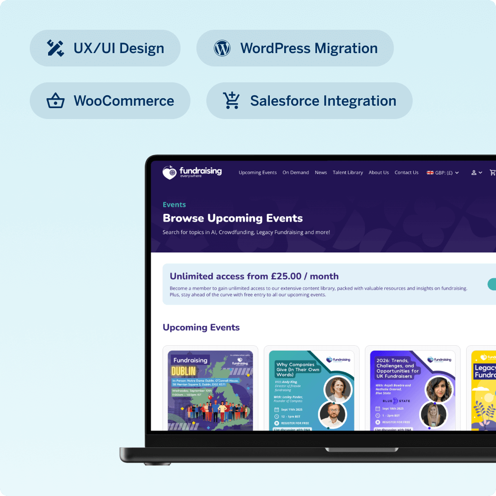
A laptop displays a website focused on upcoming fundraising events. Key features include sections for user research, competitor analysis, prioritization, and focus groups, highlighting a data-driven approach to event planning and engagement.
A laptop and a smartphone display the Funbraining website, showcasing resources for fundraisers. The site emphasizes confidence, networking, and training opportunities, with subscription options starting at £25 per month.

Results

These changes created a more engaging and intuitive purchasing journey that encourages ticket and membership sales. The improved structure highlights benefits, simplifies decision-making and keeps users engaged through checkout.

Although a full rebuild is still in its planning stages, these interim changes have already received positive internal feedback and have given the organisation a more effective short-term solution.

Why This Story Matters

This project shows that even legacy WordPress and Elementor sites can be optimised to deliver significant gains without starting from scratch.

By focusing on the most critical parts of the user journey, it is possible to improve conversions, enhance the experience for visitors and set the stage for future growth.

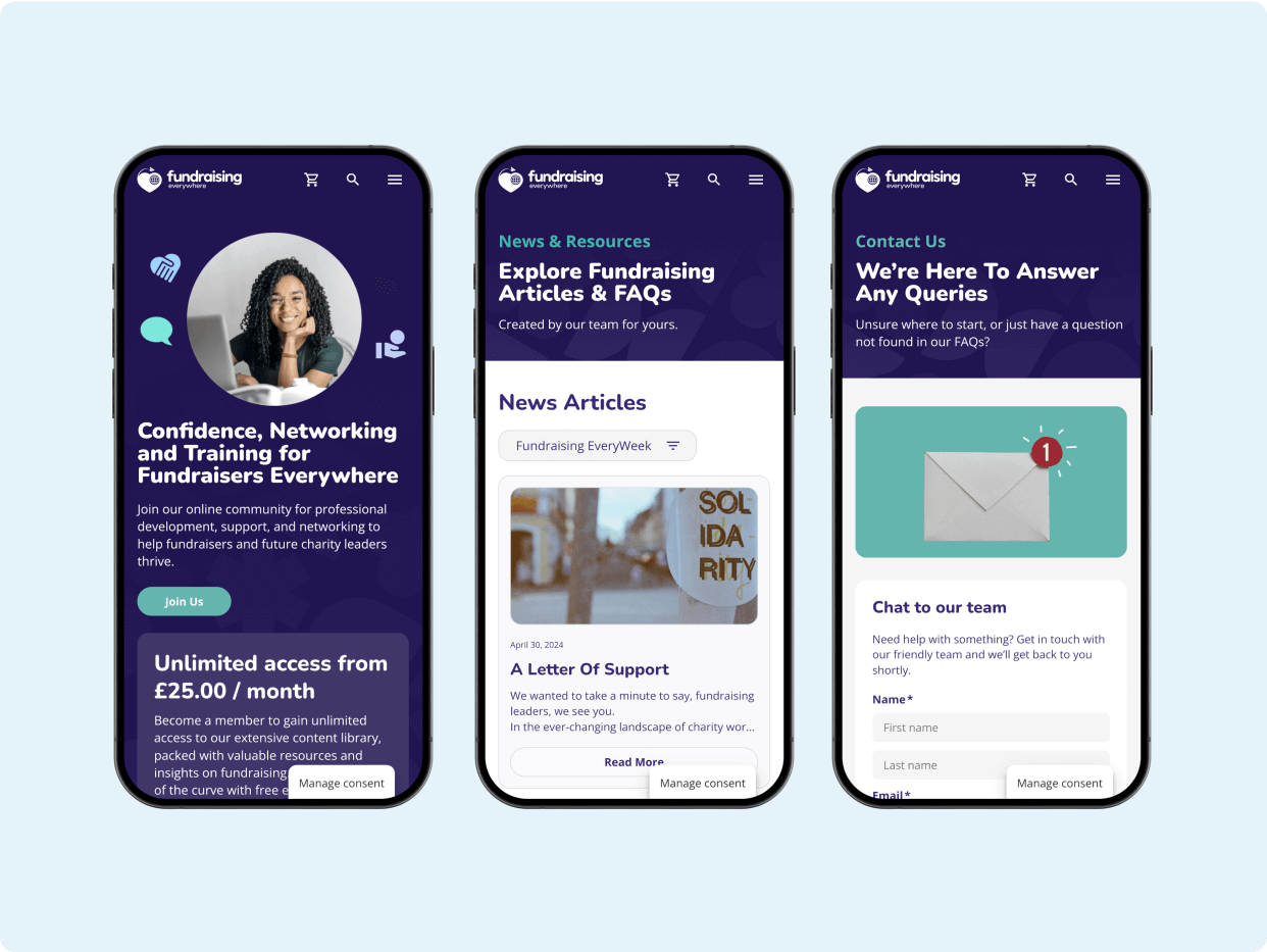
Three mobile screens showcasing a fundraising platform. The first screen highlights confidence and networking for fundraisers, the second features news articles and FAQs, and the third offers contact support for inquiries. All screens have a consistent purple design with clear calls to action.

Related Client Stories

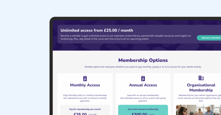
A laptop screen displays membership options with pricing details, including monthly access for £25 and annual access for £300. The layout emphasizes flexible choices for users seeking services or benefits through a subscription model.

Fundraising Everywhere – WooCommerce Rebuild

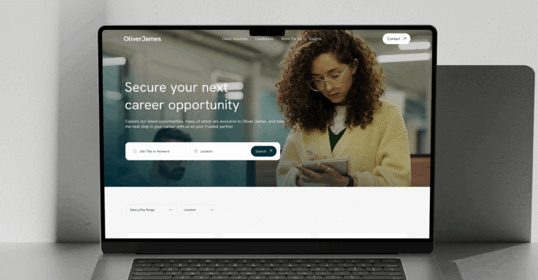
A laptop on a sleek surface displays a career opportunity website, highlighting job security options with a professional woman engaging with the site, suggesting a focus on employment and career growth.

Oliver James – Multisite Website Builds

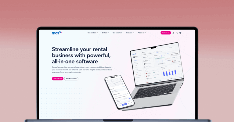
A laptop displaying a rental business software website, featuring graphs and data insights. The design emphasizes an all-in-one solution for managing rental operations effectively.

MCS Rental Software – Website Rebuild

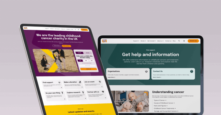
Two tablet screens display websites. The left showcases a leading UK childhood cancer charity, featuring colorful visuals and navigation. The right emphasizes support and resources related to cancer, highlighting key information for users seeking help.

Children with Cancer UK – Website Redesign & Build

Three smartphones display a food and drinks app on a blue background, showcasing menu options, a booking advertisement, and promotional offers for beverages and meals.

JD Wetherspoon – Order & Pay App

Web page showcasing meal deals with options for steak and curry dishes. Includes images of the dishes, selection filters, pricing, and availability information.

JD Wetherspoon Simplifies Menu Management with Automated Day-Based Displays

Interested in working with us?