Case Study

GravityKit – Website Build Project

GravityKit provides a suite of powerful WordPress plugins that extend Gravity Forms, transforming the WordPress form-building solution into a fully fledged no-code application platform. Its tools enable users to display, search, filter, edit, analyse, import and export Gravity Forms data on the front end of their website, making it possible to build sophisticated, data-driven experiences without custom development.


The team at GravityKit had been working on a new website for some time, but the project has not reached launch. They were looking for a fresh perspective and an agency that could help bring the site to completion ahead of the 2025 November Black Friday sales period.

WordPress Development Digital Refresh Ecommerce
Illustration of a stylized astronaut in a blue and gold spacesuit, floating in space against a white circular background.

Introduction

Building a Modern, Scalable Digital Refresh for GravityKit

GravityKit came to Filter needing to complete a long-running website project ahead of a critical Black Friday deadline. 


While an initial build and designs existed, the platform lacked clarity, flexibility, and usability, and the designs felt overly complex. GravityKit wanted a modern website that reflected their innovative values, showcased their product suite, and guided users from discovery to conversion.


Filter reviewed and rationalised existing designs, simplifying templates and rebuilding the front end on top of GravityKit’s proven technical foundations. Business-critical integrations were retained and the result was a cleaner, more accessible user experience with a scalable foundation for future growth.

Relationship Length

The new website launched in November 2025

Focus

Rebuilt e-commerce platform, simplifying a complex design and prioritising user journeys

Problem Problem

  • A legacy website project with a platform and build that felt overly complex, lacked usability and had stalled as a result
  • Initial designs that did not clearly present GravityKit’s product suite or support intuitive user journeys
  • A fixed deadline to deliver a new website in time for a critical revenue period

Solution Solution

  • UX/UI led iteration on existing designs, prioritising key conversion journeys and clear product information
  • Rationalisation of page templates and blocks to be flexible, easy to update and scalable for future needs
  • A rebuild which retained critical integrations, processes and plugins while delivering a modern, improved UI

Result Result

  • Launched on time driving significant commercial impact
  • Modern, intuitive UI highlights products and simplifies user journeys for a smoother experience
  • Scalable CMS enables fast, consistent marketing updates and supports ongoing growth

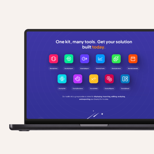
Laptop screen displaying a toolkit interface with colorful icons representing different digital tools. Text above reads: "One kit, many tools. Get your solution built today."

The Challenge

GravityKit had been working on a new website for some time but the project has not reached launch. Although initial designs and a build existed, the team felt the approach was overly complex and the platform lacked the flexibility and usability they needed.

Their existing website had served them well, but the team was ready for a fresh, modern platform that reflected the organisation’s innovative and forward-thinking values. 

The project also presented an opportunity to rethink how their product suite and offerings could be presented more clearly, with a strong focus on user journeys that guide visitors seamlessly from consideration to conversion.

With a fixed deadline tied to the Black Friday sales in November, a key revenue opportunity for GravityKit, it was essential that the new website be delivered and fully live in time to capitalise on this critical period.

Our Approach

GravityKit brought existing designs to the project but wanted them reviewed from a UX perspective to optimise content presentation and ensure key user journeys were fully supported. 

Filter’s UX/UI team worked closely with GravityKit to evaluate each template and block, retaining what worked and refining or reworking the rest. Guided by best practices and SaaS benchmarking, we developed a streamlined blueprint that simplified templates and blocks while making the site easier to manage and scale.

From a technical standpoint, GravityKit’s existing website relied on a complex set of plugins and integrations that were critical to business operations. While there was an opportunity to simplify this setup, those critical and deeply embedded integrations needed to be retained.

To achieve this, Filter took a copy of the existing site, removed the legacy user interface and rebuilt the front end in line with the new designs. This approach ensured business-critical integrations continued to operate as before, while delivering a significantly improved, modern look and feel.

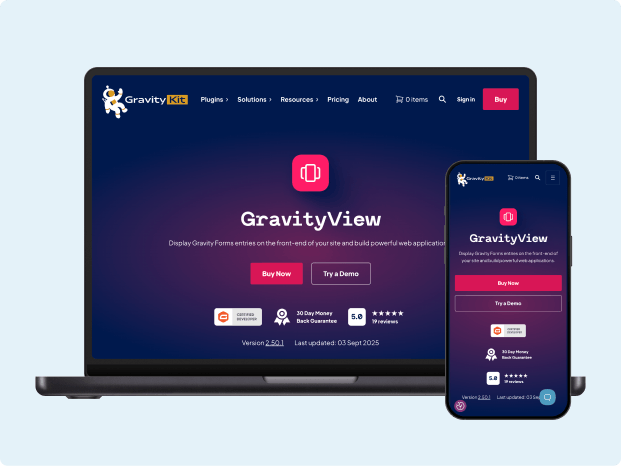
GravityView plugin website displayed on a laptop and smartphone, highlighting its responsive design. The interface includes navigation menus, plugin information, and purchase options against a dark background.
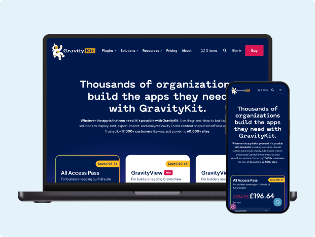
GravityKit website displayed on a laptop and smartphone highlighting its responsive design

Results

The new GravityKit website launched in time for Black Friday in November 2025 and since then, has been delivering commercial impact. 

Transactions on the new pricing page are up +167% with GravityView product page transactions up +15% and conversions from the homepage have nearly tripled (0.21% → 0.58%)*.

Alongside these results, the project delivered a modern, confident user interface that better reflects GravityKit’s position in the market. Product information is clearer and more prominent, and key user journeys have been simplified to guide visitors more effectively to the most appropriate product for their needs and onwards through to conversion.

Behind the scenes, GravityKit now benefits from an intuitive content management system that enhances their marketing capabilities. 

Discounts, sales, offers, and promotions can be implemented quickly and consistently across the site, while a reduced set of blocks, templates, and shared patterns allows changes to be made efficiently and at scale.

*Filter resolved legacy tracking issues as part of the project, so some of this uplift also reflects cleaner measurement.

Why This Story Matters

This project demonstrates how a complex, stalled website can be transformed into a platform that meets business needs while driving measurable commercial results. 

GravityKit needed a partner who could deliver a technically robust, scalable solution with a strong focus on user experience, helping to drive engagement and maximise conversions.

The story highlights the value of a thoughtful, UX led approach that balances innovative, visually appealing design with functionality and manageability. 

By reviewing and rationalising existing designs, simplifying templates, and prioritising key user journeys, the project delivered a website that looks great while being far easier to manage, update and scale.

Finally, the project demonstrates the importance of moving at pace to prepare for a key revenue period. Launching the site in time by prioritising elements and aligning as one cohesive team with our client allowed us to deliver in a short period to deliver their results.

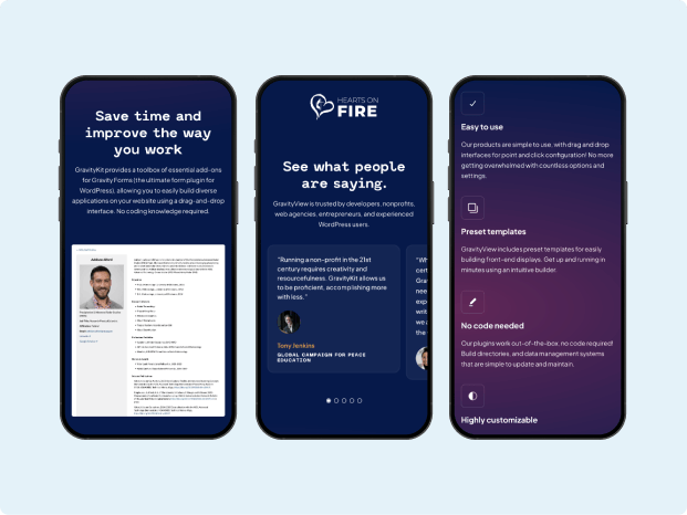
Three smartphones display a digital tool with features highlighting time-saving and workplace improvement. The screens show user reviews and a settings menu, set against a sleek, dark theme.

Related Case Studies

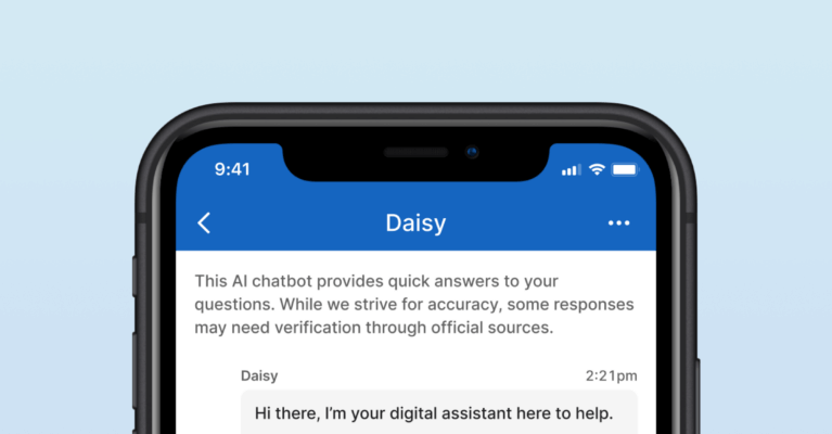
Smartphone screen displaying a chat with an AI assistant named Daisy. The AI offers help and requests user questions. A user asks about being unable to work due to sickness. The background is light blue.

JD Wetherspoon – AI Chatbot

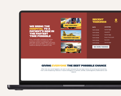
Laptop displaying a website with sections for medical transportation services, featuring images of emergency vehicles and a focus on rapid patient care.

East Anglian Air Ambulance – Digital Brand Application

Interested in working with us?