Case Study

CEPA Website – Continuous Improvement

The Centre for European Policy Analysis (CEPA) is a leading think tank dedicated to strengthening transatlantic relationships and advancing democratic values across Europe and North America. As their influence grew, their fragmented website struggled with usability and scalability, making it difficult to showcase research, events, and analysis effectively.


We inherited CEPA’s website to support them with creating an improved, user-friendly platform with consistent design, improved performance, and flexible architecture, built to highlight their work today and support growth for the future.
WordPress Performance Improvements Non-Profit Organisation
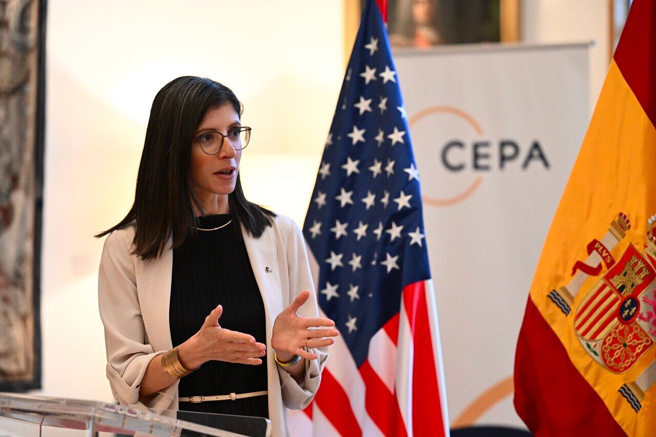
A woman speaks at a podium with U.S. and Spanish flags in the background, discussing topics related to international collaboration. The setting suggests a formal event, possibly focused on diplomacy or trade.

Introduction

Improving the User Experience & Performance of an Inherited Site

CEPA plays a key role in shaping policy and informing transatlantic strategy. Its website is a vital platform for publishing research and engaging decision-makers, but content layout and site structure had become fragmented and difficult to manage.


As CEPA’s visibility and output grew, users struggled to navigate the site and the internal team lacked confidence in scaling and maintaining it.


On inheriting the site, the Filter team’s immediate priorities were to establish consistent design patterns, enhance search performance, and strengthen the underlying architecture, ensuring scalability to support CEPA’s mission and future content growth.

Relationship Length

Retained services since February 2024

Focus

Ongoing continuous improvements for a digital experience transformation

Services

Problem Problem

  • CEPA’s website was limiting engagement
  • It was difficult to navigate
  • Users experienced slow load times
  • Key content was not displayed effectively

Solution Solution

  • Redesigned key components of the site
  • More intuitive content structure
  • Optimised performance
  • Powerful search using SearchWP

Result Result

  • 70% faster load times
  • Deeper engagement
  • Improved content discoverability
  • A more confident internal team

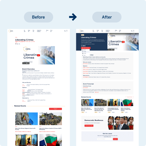
A visual comparison displays a website redesign, showcasing the transition from the original layout on the left to a modernized version on the right. The updated design highlights improved organization, clearer text, and a more engaging user experience.

The Challenge

CEPA’s WordPress site had become increasingly challenging to navigate. Dense content architecture, limited search functionality and inconsistent performance were hindering user experience and discoverability.

The organisation needed more than cosmetic changes, it required a strategic solution grounded in a clear understanding of the underlying issues, all within the practical constraints of a nonprofit.

As we were not the original developers, we inherited the existing site and quickly assessed, adapted and implemented improvements to support CEPA’s long-term digital goals.

Our Approach

We partnered with CEPA to transform their disjointed website into a cohesive, user-friendly platform. Through a collaborative Discovery Phase, we identified key areas for improvement, including content structure, usability and editorial workflows.

We redesigned templates, introduced consistent design patterns and simplified content management.

To enhance discoverability, we integrated SearchWP, enabling faster, more accurate content searches. The refreshed interface and scalable architecture now support both current needs and future growth.

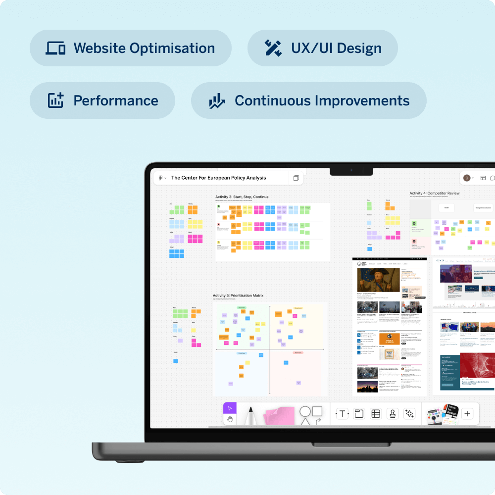
A laptop displays findings from user research, competitor analysis, prioritization, and focus groups. Colorful charts and graphs illustrate data insights, supporting strategic decision-making for the Center for European Policy Analysis.
A laptop and smartphone display a search interface showing news articles related to current events. The design is clean and user-friendly, highlighting featured stories with images and text.

Results

The new site has significantly improved performance, usability and internal operations. Page load times are now 70% faster, improving accessibility for a global audience.

Visitors are engaging more deeply with content, spending longer on key pages and navigating further into the site. Bounce rates, particularly in reports and analysis sections, have fallen and the improved search functionality allows users to quickly find relevant publications.

Internally, the CEPA team can now manage and publish content more efficiently and with greater confidence.

Why This Story Matters

This isn’t just a story about refining a WordPress website; it’s about empowering a non-profit to amplify its voice on the global stage.

Our experience in helping CEPA with their website shows how the right digital partner delivers more than a technical solution, unlocking lasting organisational value while giving a small marketing team the flexibility and performance they need to focus on what matters most.

If you’re looking for the right WordPress partner to take on the continuous improvement of your website, Filter are here to help.

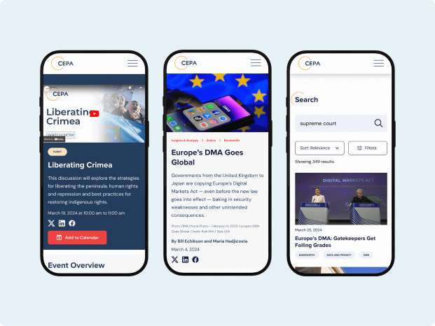
Three mobile device screens displaying articles and events related to current global issues, including "Liberating Crimea" and "Europe's DMA Goes Global". The screens feature a clean design with headlines, images, and navigation elements, highlighting content accessibility and engagement.

It’s been a pleasure working with the Filter team to support CEPA’s website goals. They’ve stood out for their ability to listen, understand our needs, and translate them into thoughtful designs with fresh solutions.

A person with long, curly brown hair, wearing glasses and a black top with a white collar. They are smiling against a plain background.
Sarah Krajewski, Senior Program Officer for Communications & External Affairs CEPA

Related Client Stories

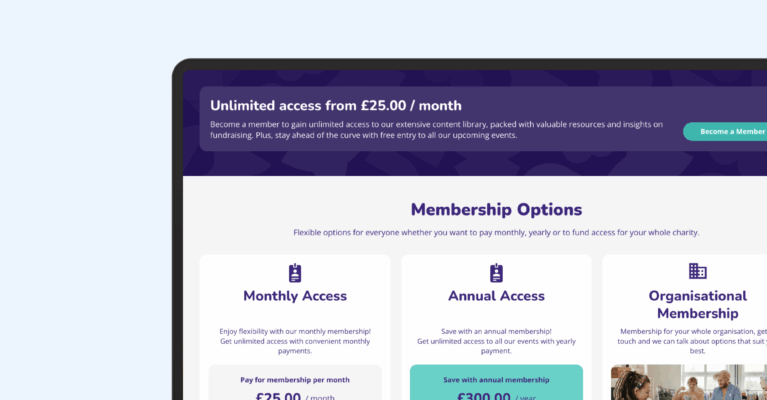
A laptop screen displays membership options with pricing details, including monthly access for £25 and annual access for £300. The layout emphasizes flexible choices for users seeking services or benefits through a subscription model.

Fundraising Everywhere – WooCommerce Rebuild

A laptop on a sleek surface displays a career opportunity website, highlighting job security options with a professional woman engaging with the site, suggesting a focus on employment and career growth.

Oliver James – Multisite Website Builds

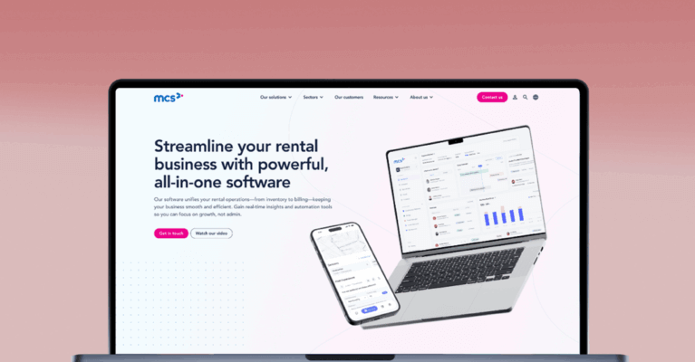
A laptop displaying a rental business software website, featuring graphs and data insights. The design emphasizes an all-in-one solution for managing rental operations effectively.

MCS Rental Software – Website Rebuild

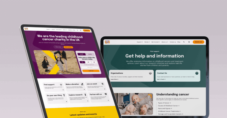
Two tablet screens display websites. The left showcases a leading UK childhood cancer charity, featuring colorful visuals and navigation. The right emphasizes support and resources related to cancer, highlighting key information for users seeking help.

Children with Cancer UK – Website Redesign & Build

Three smartphones display a food and drinks app on a blue background, showcasing menu options, a booking advertisement, and promotional offers for beverages and meals.

JD Wetherspoon – Order & Pay App

Web page showcasing meal deals with options for steak and curry dishes. Includes images of the dishes, selection filters, pricing, and availability information.

JD Wetherspoon Simplifies Menu Management with Automated Day-Based Displays

Interested in working with us?